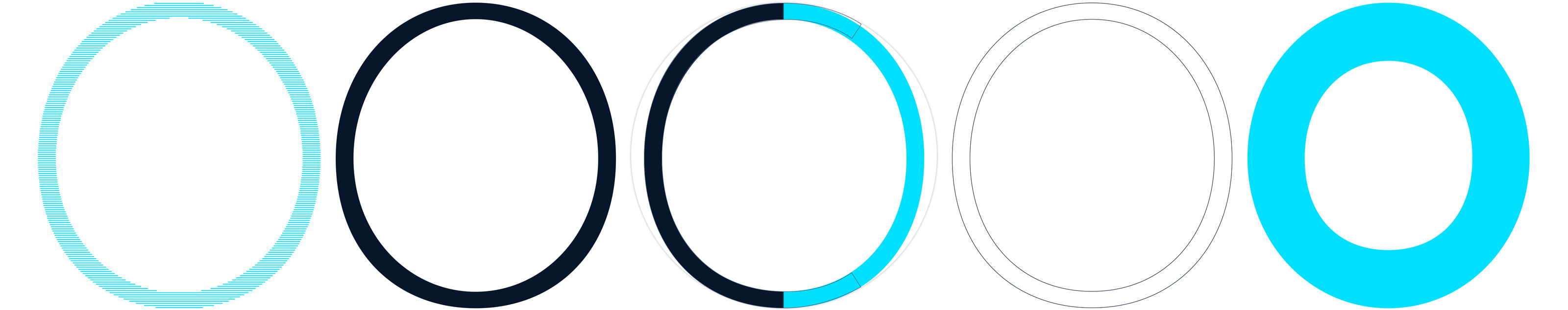
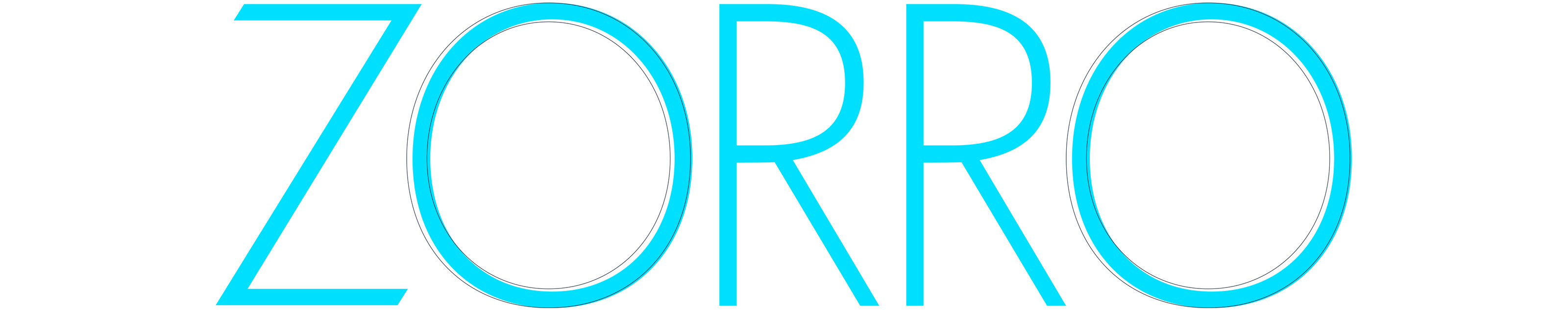
Draft for majuscule O FN QUORUM
The letter O comes with a slight overhang above baseline and cap height. Contrasts to a geometric circle are visible at first glance, the Versal-O is slightly slender in the current design. Stroke contrast is at approx. 94 % abd therefor quite small. The form initially appears »oval«. Perhaps the form is going to be more square yet not compact.