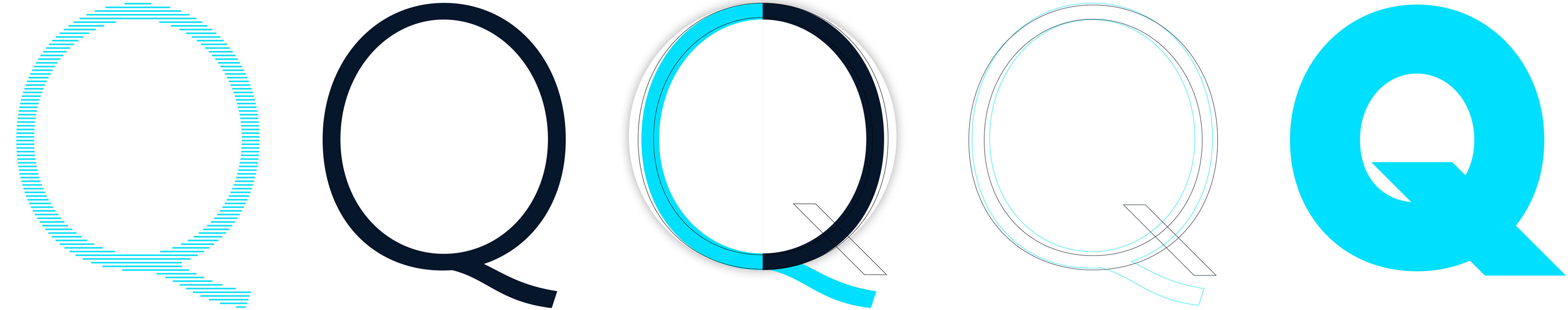
Draft for majuscule Q FN QUORUM
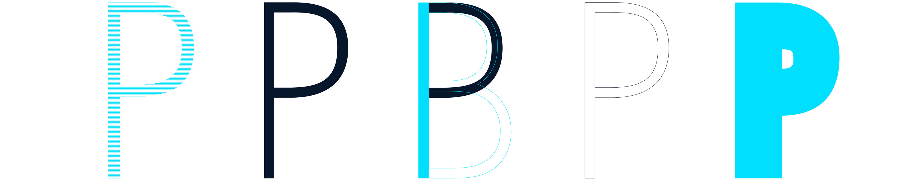
Referring to Versal-P obviously there are a few different variants to be realised. Through a clearly visible incision derived from earlier lead letters, P can even surprise and is stylistically based on humanistic fonts. Whether there will be an incision or not, has not been decided yet. For an <>human grotesque font an incision would make sense.
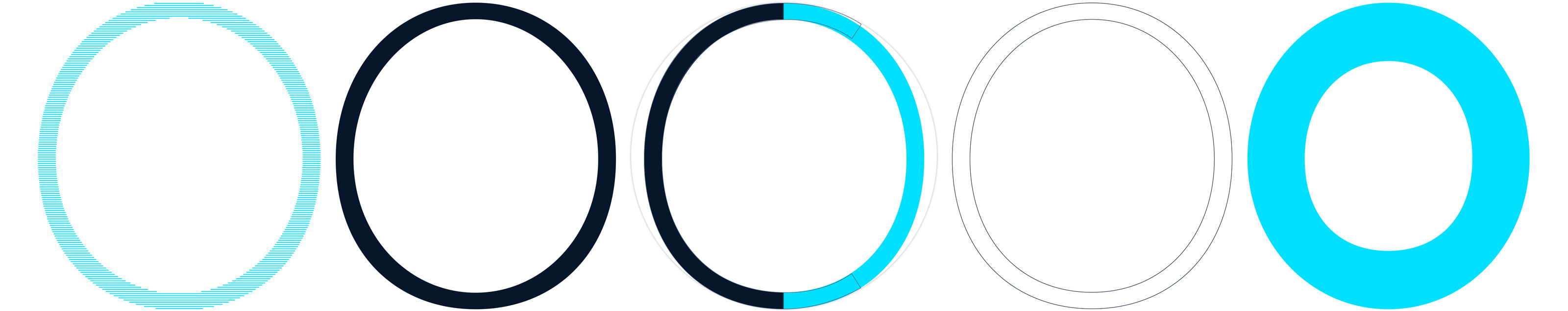
The letter O comes with a slight overhang above baseline and cap height. Contrasts to a geometric circle are visible at first glance, the Versal-O is slightly slender in the current design. Stroke contrast is at approx. 94 % abd therefor quite small. The form initially appears »oval«. Perhaps the form is going to be more square yet not compact.
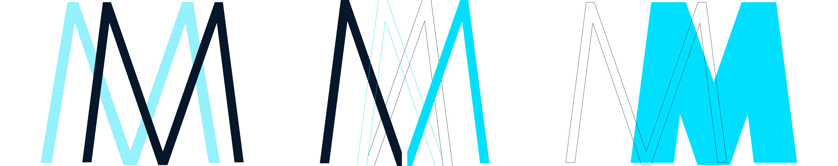
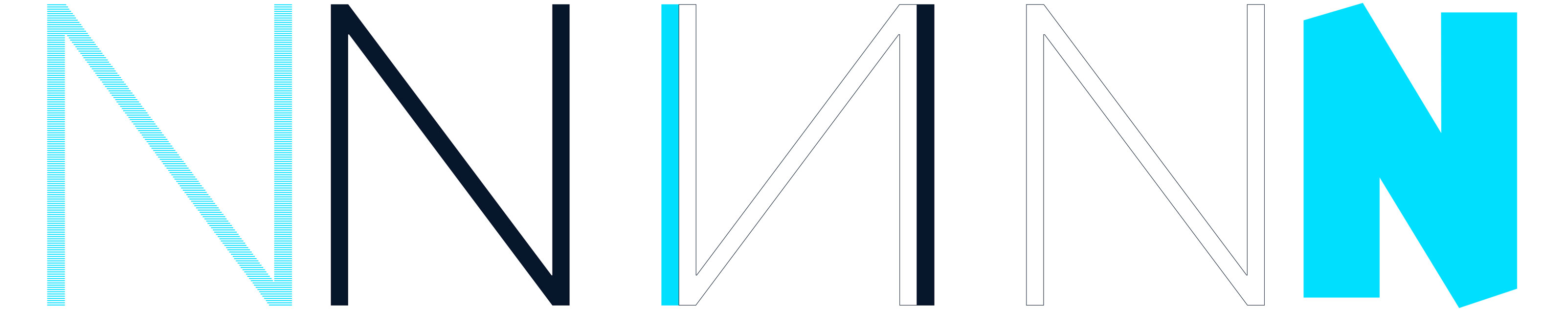
The capital N will have an obtuse apex, that’s for sure. Further design characteristics are still pending, an angled apex would please the human grotesque font nicely. Just like it is the case with capital »M« the apex could rise above the cap height; that variety will be in the next iteration period.
Oneself will be concerned about capital M a lot in the future since it is too massive. The legs will certainly remain angled, whereas apexes remain obtuse. Based on the following drafts one may easily realize that the apex and design of the diagonal have not been completed yet.